How good is the Garmin Forerunner 265's heart rate sensor?
I recently bought the Garmin Forerunner 265 after I did a lot of research on what the best fitness watch is for my use case. On my way I found The Quantified Scientist, a YouTuber that does a lot of testing on fitness gadgets in a scientific way. Unfortunately he hasn't done a video on the Forerunner 265 yet, so I decided to make some tests on my own to validate how good the watch's heart rate sensor really is. These tests and the representation of the results were heavily inspired by him. To see the technical background on how I did the testing and the data analysis, take a look at the end of this post.
To sum it up I wore a really accurate heart rate chest strap and the watch at the same time and compared the measured values. For each sport I created two types of diagrams:
- A scatter plot. Every point represents the sensors' readings at a time. A point's x-value shows what the chest strap measured and its y-value shows what the watch measured at this point in time. If they measure the same value (so the watch is 100% accurate) the point is on the red line. If the watch measures a heart rate lower than the actual heart rate the point is to the right of the red line and if it's higher then it's to its left. So the more points are close to the red line, the more accurate the watch's sensor is. The points are also transparent so the more points there are the darker the spot gets.
I also added the correlation (the R-Value) to the top left. To put it in simple words: The higher the value, the more accurate is the sensor. 1 is the maximum and 0 would mean that the readings are completely random. - A line diagram. This diagram shows the heart rate (y-value) over the time (x-value). There are two lines: The red line is the watch's measured heart rate and the blue line is the reference heart rate from the chest strap. The more these two lines match, the better is the watch's accuracy. With this type of diagram you can see if the watch lags behind the real heart rate or if it misses spikes
I did tests with the following sports:
- Badminton
- Longboarding
- ...
Badminton
I recorded a 2 hour session of badminton.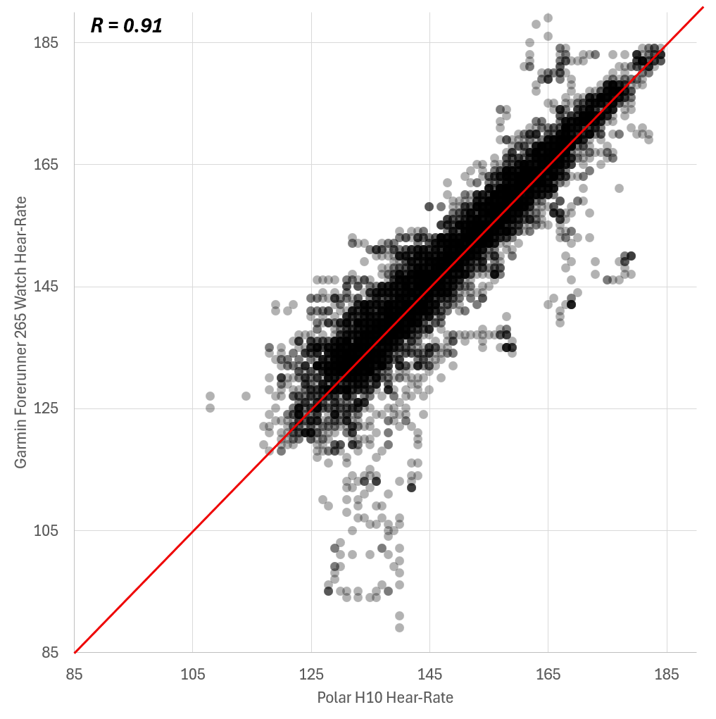
The scatter plot looks pretty good. Most of the points are really close to the red line. Some of the points are below the line, which indicates that the watch underestimated the heart rate. Those seem to be rare outliers since those aren't many points. The correlation of 0.91 is pretty decent but in comparison to other watches it's on the lower end. This YouTube-video from the Quantified Scientist shows the correlation of all the other watches he tested to have a reference. It's really not bad but there are many models that perform better.
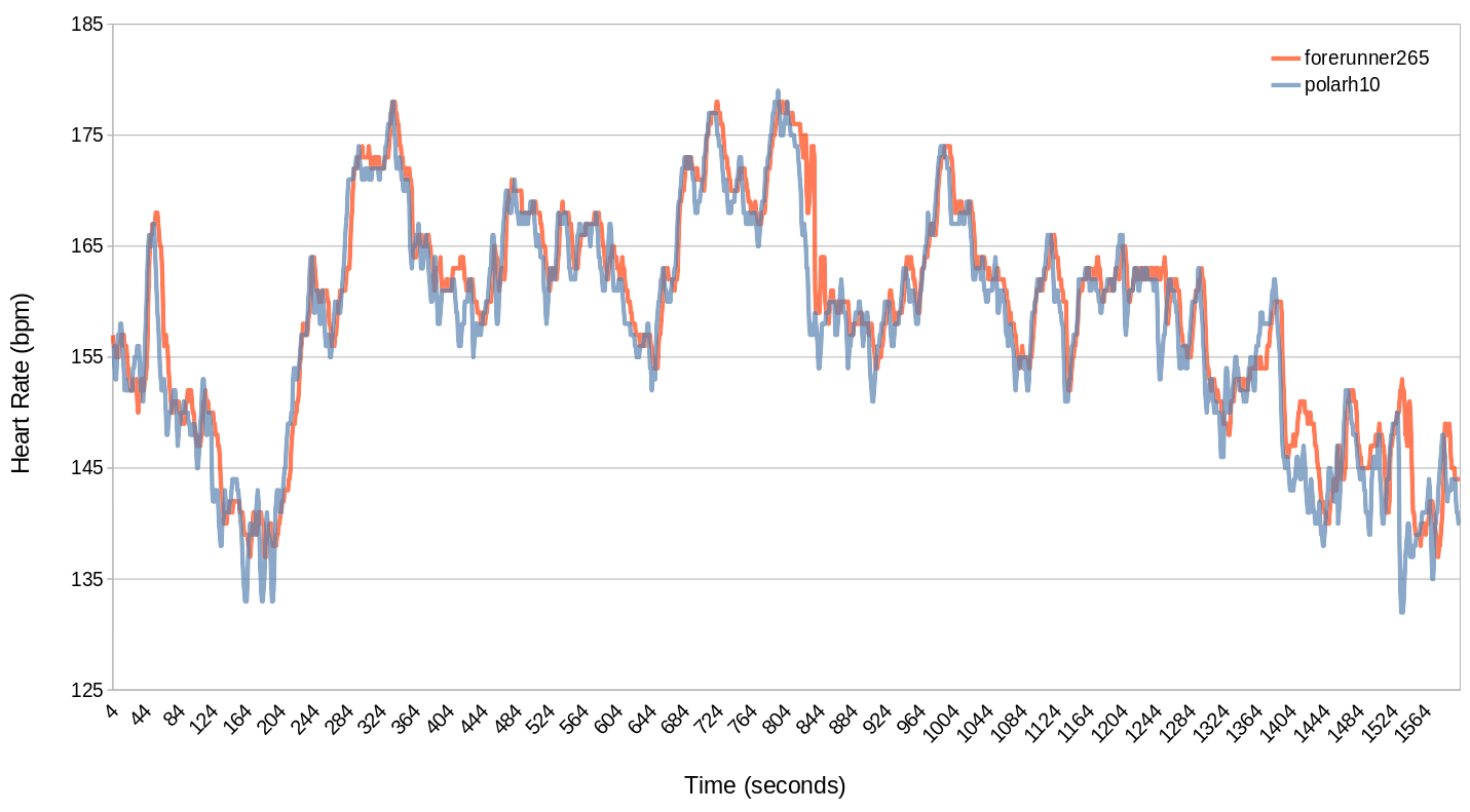
The line diagram gives us some insight on why and at which points the watch got inaccurate. This diagram is only a snapshot of the two hour session since you can't see the fine differences on such a large scale. As you can see the watch often lagged behind a little bit. This isn't too bad for this kind of sport since I'm interested in the time I spend in the heart rate zones which isn't affected by this lag. The watch had some trouble picking up some smaller changes in heart rate and measured a higher heart rate than it should have. Apart from the outliers you can see in the scatter plot (that isn't part of this snapshot) the watch's heart rate was never really lower than the chest strap's one.
I'm pretty happy with these result for badminton. I only need the heart rate in this sport for the Garmin to determine my acute load and training effect to get insight on the effects on my total training load. For this purpose the sensor is accurate enough. Especially in badminton my top priority is having fun.
To be continued
I will expand and update this post with more data on different types of sports like longboarding, cycling, running, swimming and more in the future.
Technical background
How to get the measurements
In my tests I did different types of sports while wearing both the Garmin Forerunner 265 and the Polar H10 heart rate chest strap. These measurements were recorded simultaneously using the ANT+ HRM Heart Rate Monitor data field from the Garmin Connect IQ Store. You just add it to an activity as a data field and it will record both the watch's and your chest strap's data. If you want to do this yourself, you should take a look at the app's manual. I also decided to disable the heart rate alarm that made a sound everytime my heart rate drops under zone 1 (go the app in your Connect IQ store, go to "Settings" and put a "0" in the "Low HR Alert" field of every user). After you added your data field and adjusted the settings you just record an activity like you usually would. When you finished the activity you can see a new diagram in you Garmin Connect (Web-)App: ANT Heart rate (bpm). This is your cheast strap's measured heart rate. It might be tempting to use Garmin's built in overlay feature that lays one measurement over the other. But if the minimal and maximal measurements weren't the exact same the scale will be different. So the ANT Heart Rate has a scale from 100 to 200 and the watch has one from 80 to 200. This cannnot be used to compare.
How to use the data
To use the data in an external program you can download it in the .FIT file format. Then I used the FIT SDK to convert the FIT file to a CSV file. Just download the SDK, extract it, go into the java directory, open a terminal and execute this command where the last argument is your downloded .FIT file:
java -jar FitCSVTool.jar ./19434511632_ACTIVITY.fit.
Now you have a .CSV file with a bunch of values. You could write a script that deletes all the unneccessary and invalid data. But since I won't be doing this very often I manually edited the file in LibreOffice Calc. I removed all columns except the time stamp, the watch's and the chest strap's heart rate readings. I also removed every line that has no heart rate (0bpm) or an extremely low heart rate (like every value under 40). For the scatter plot I had to use MICRO$OFT Excel since LibreOffice doesn't have an option to make the data points transparent. For the line diagram I could use LibreOffice Calc. I needed to do some fine tuning to get the diagrams just the way I wanted. To get the correlation you can use this document.